RangeMe Sign-up Page
Helping users quickly and easily sign-up.
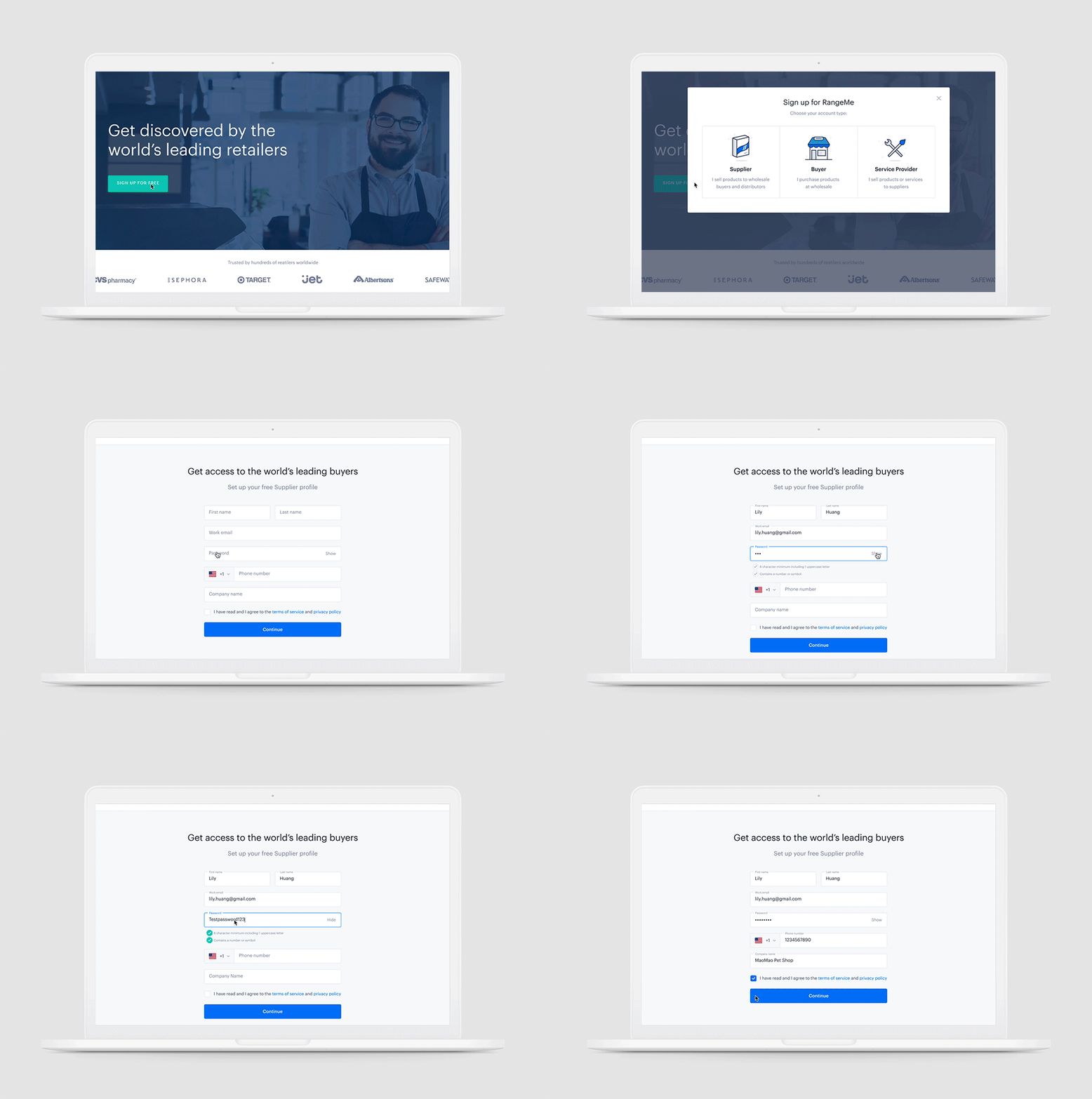
Starting June 2020 Suppliers, Buyers, and Service Providers could select an account type during sign-up with updated form fields and improved password validation.
In 3 days, we helped over 5,000 people make an account.
My Role
I led the end-to-end redesign of RangeMe’s signup flow. As an individual contributor, I worked closely with Product, Content, and Engineering leads to optimize the new user experience.
Tools
Figma | Illustrator
Duration
3 weeks
Research
What was causing users not to sign-up?
Current user flow
From the user flow from above and data I gathered from user feedback we found out that:
Users couldn’t choose their account type
When a user clicked “sign-up for free” it led them directly to the Supplier sign-up page. Users could not easily find the correct sign-up page for their account type.
Users had difficulty confirming passwords
The confirm password fields lowered conversion rates and was responsible for over a quarter of all users abandoning the sign-up form. It was also responsible for hundreds of user corrections, including field refocuses and deletes.
Ideate
Improved user flow
Initial ideas
Version 1 of the account type selection modal.
Version 1 of the improved password field validation.
Final solution
Account type selection
This new modal will:
Give users context and a clear idea of what account types there are, so they can make the right selection
Illustrations and descriptions help users understand at a quick glance what the account types are
Improved password field
The confirm password field was removed and replaced with an unmasking option and better password requirements. This update allowed users to:
Check what they typed to prevent any errors
Know clear expectations from the beginning meaning fewer errors
Not only that, but it increased form starts, completions and the conversion rate.
Floating Text Labels
This new floating text label feature will:
Give users context and a clear view on what field they’re on at all times
Provide a clean inline label experience for the user so the form is easily scannable
Prototype
Test
After rolling out this new update to the sign-up flow and sign-up page we also tracked the data afterwards to see what impact these new changes would make.
In the first 4 months, we saw a 5.34% increase in sign-ups
And comparing the number of sign-ups from the previous year we made quite a jump.
~2,500 new suppliers per week in July 2019
~5,500 new suppliers per week in July 2020
Iterate
Based on the testing the improvements had a positive impact for the business. However, the sign-up improvements don’t stop there. For next steps I would like to:
Improve the later steps of the sign-up flow
Keep updated on future design heuristics for form fields


