Ordering (Buyer Checkout)
Click a button. Order products.

The challenge
Our goal for the project was to complete the buyer product discovery process by transforming RangeMe into an online wholesale marketplace, empowering small business owners and independent brands to buy and sell wholesale online.
🔥The problem to solve: Seamlessly design an entire add to cart/checkout process within our existing product.
Currently in a staged rollout
Duration
3 Months
Tools
Figma | Illustrator | Photoshop
My role
I planned and executed the entire design process from problem definition to implementation. I also worked with Product Managers, Marketing, and Engineering to integrate their various requirements and feature requests into a multi-phase release plan.
Research
Working closely with this project’s PM, Ginger Lee, we conducted thorough research in order to clearly define the deliverables and requirements.
User interviews

Target buyers
US buyers
Small and medium-sized businesses
Interested in ordering via RangeMe
Insights
After interviewing 20 RangeMe buyers we took quotes/ideas/topics from each interview and affinity mapped them to identify key insights on what these buyers had to say about ordering. In the end, we discovered 3 important factors that our buyers consider when ordering a product:
Detailed product information to ensure proper product selection
Efficient checkout process to save users time and allow for easy purchase of products
Clear product organization for a seamless shopping experience
Define
Create a platform for buyers to easily find and purchase products from trusted suppliers.
Buyer user flow
Ideate
After understanding both the user and business needs of the project and also being able to conceptualize the entire user flow there were 4 areas to focus on for our initial sketches.
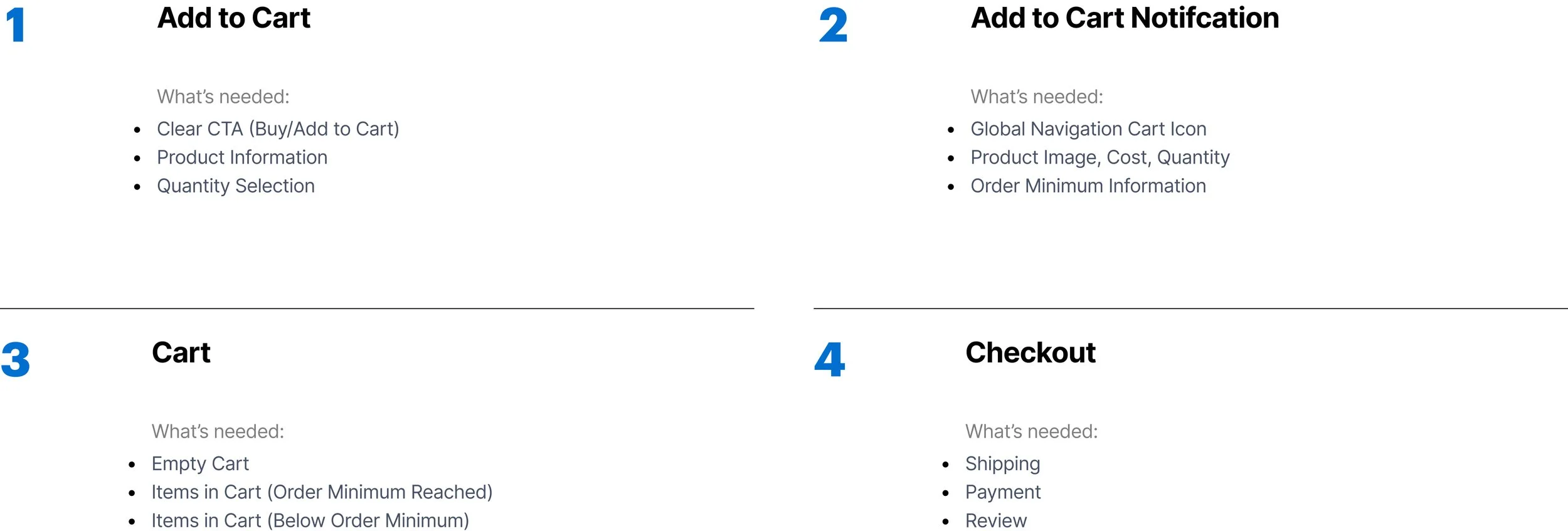
Low-fi sketches


Early Design Feedback
After going through my initial sketches with our PM, she noticed that I was designing out a typical cart for a B2C product. The designs showed products added to cart with no specific grouping. This would not work for our product which is a B2B marketplace. Areas I needed to reconsider:
How do we organize items with different shipping costs in the cart?
How do we best organize added items from various brands that have varying order minimums?


Mid-fi wireframes
The lo-fi sketches went through multiple iterations where usability and engineering feasibility considerations were taken into account. Once they had been refined, I moved onto designing mid-fi designs that showcase the interactions and navigation flows to other stakeholders in the business in order to validate assumptions and collect valuable feedback.
High fidelity wireframes
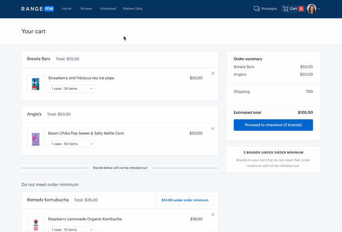
Cart details
After continual feedback and many iterations, these are the final hi-fi designs of the B2B cart workflow. This shopping cart design satisfies the project goals to achieve better conversion:
Clearly and intuitively lays out items
Provides buyers all necessary information
Allows modifying of item details
The impact
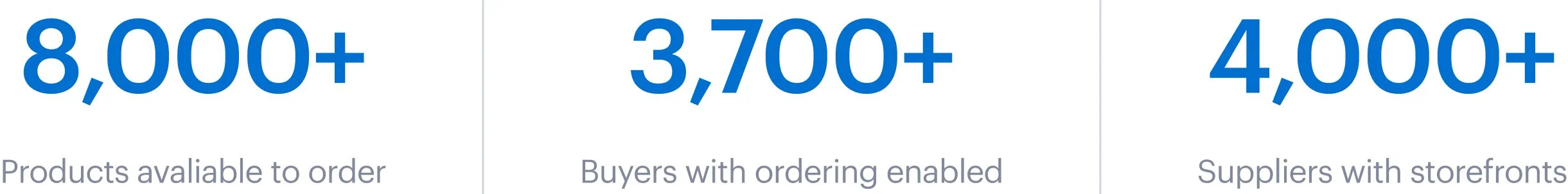
By the end of the beta period we had exceeded expectations for:
Products available to order by 77%
Buyers with ordering enabled by 23%
Suppliers with storefronts by 160%
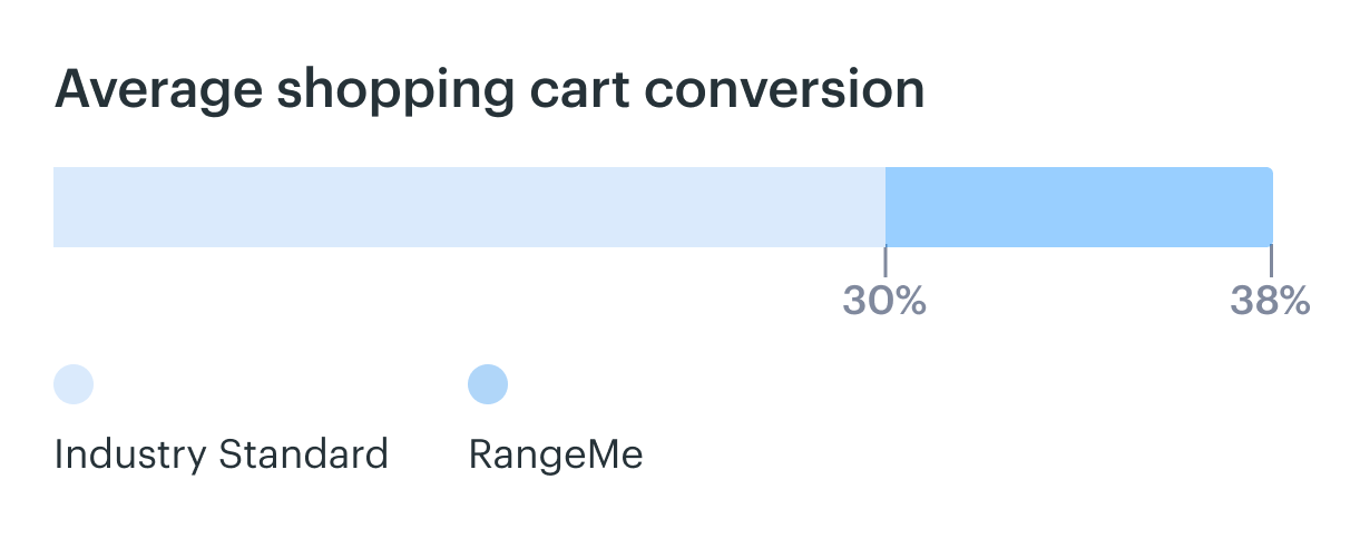
Not only did the designs excel in onboarding products, buyers, and suppliers we also exceeded the industry standard for shopping cart conversion rates.
Based on usability testing, we added a “net 60” payment option to simplify checkout and encourage larger orders. We also enabled volume-based discounts to motivate bulk purchasing and provided key supplier info, like response times and product reviews, to give buyers confidence when trying new suppliers.