Model my pay
A Simpler Way to Plan and Save
Overview
Context
I helped redesign Model My Pay to make it easier for employees to understand how changes to their pay, benefits, or deductions affect their take-home income. Focusing on casual users, we simplified the flow for both mobile and desktop to create a more approachable, intuitive experience that helps people confidently explore “what-if” pay scenarios and make smarter financial decisions.
Duration
7 months
My Role
Product Designer
Approach
goal
to design a simple, intuitive experience that lets employees explore their pay with confidence. Inspired by apps like Lemonade, Zebra, and mortgage calculators, I streamlined interactions and modernized the interface to create an experience that feels human, approachable, and built for everyday users.
Design & Implementation
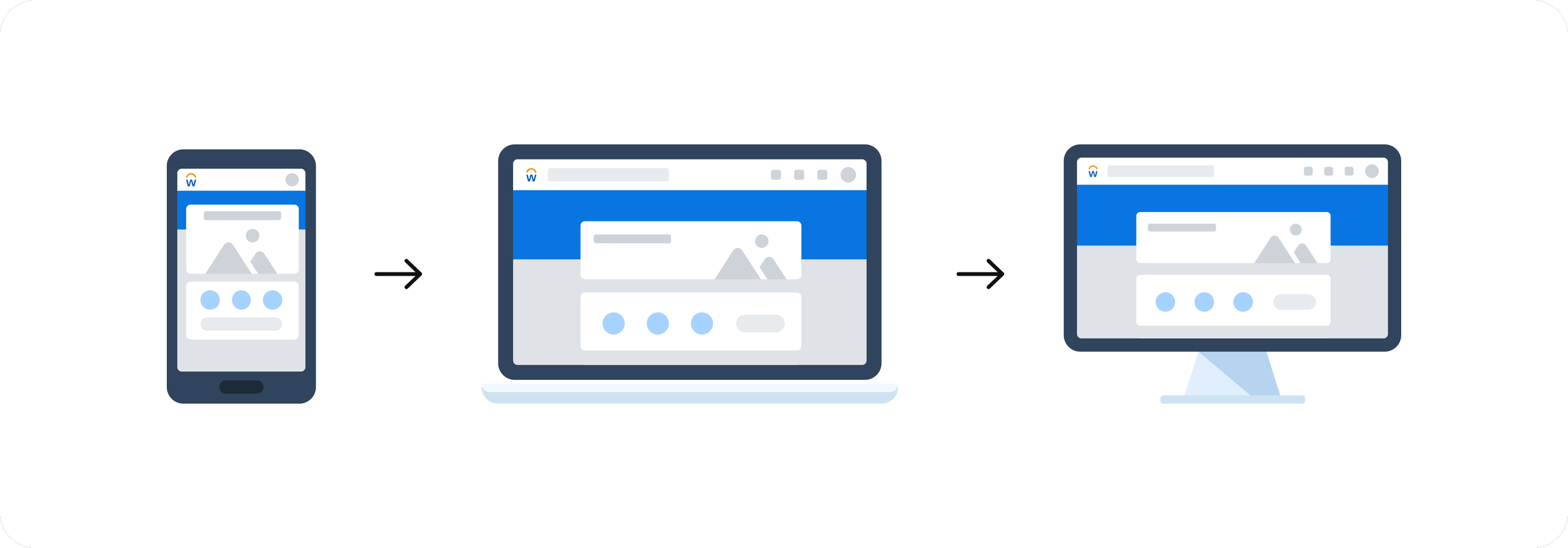
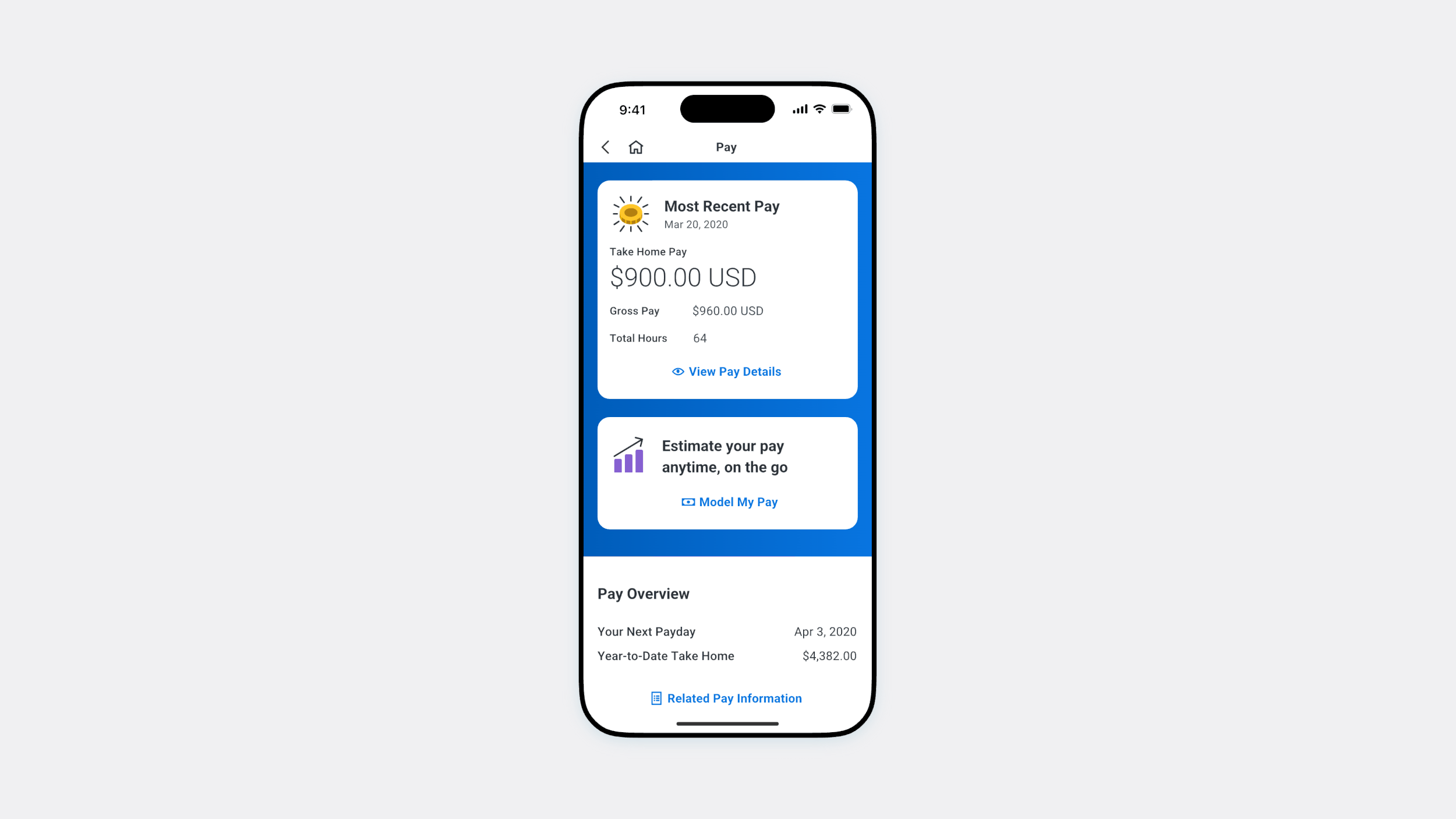
Why mobile first?
A mobile-first approach was essential because most employees check their pay details on the go, often in short moments between tasks. Designing for mobile forced the experience to be clear, lightweight, and focused on the core interactions
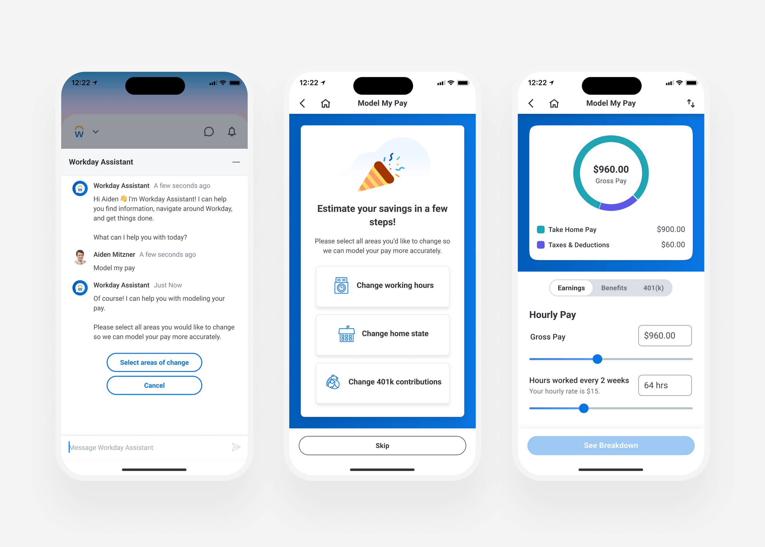
3 Concepts to Simplify Pay Planning
I explored 3 mobile-first directions informed by my initial comparative research: a conversational, assistant-led flow; a guided, non-conversational workflow; and a calculator-style experience where users could adjust inputs and instantly see the impact.
User Insights
Research
Our researcher, Eric Anderson, led moderated 1-hour user testing sessions that gave us direct visibility into how participants moved through the experience in real time. Observing their reactions, questions, and moments of hesitation helped us understand what felt intuitive and desirable, ultimately guiding the direction of our final approach.
👤 12
Participants
⏰ 60 min
user interviews
What was tested
We tested all three mobile concepts (Assistant, Guided Questions, and Calculator) as well as the existing desktop experience.

What we learned
Mobile felt more modern & intuitive
Users needed clearer onboarding & guidance in the desktop experience
the calculator mobile concept was most visually clear & encouraged exploration
“This all makes a lot of sense to me. I like the look of this one way
better. It’s graphically appealing and the [categories] make more
sense as tabs.”
what direction it shaped
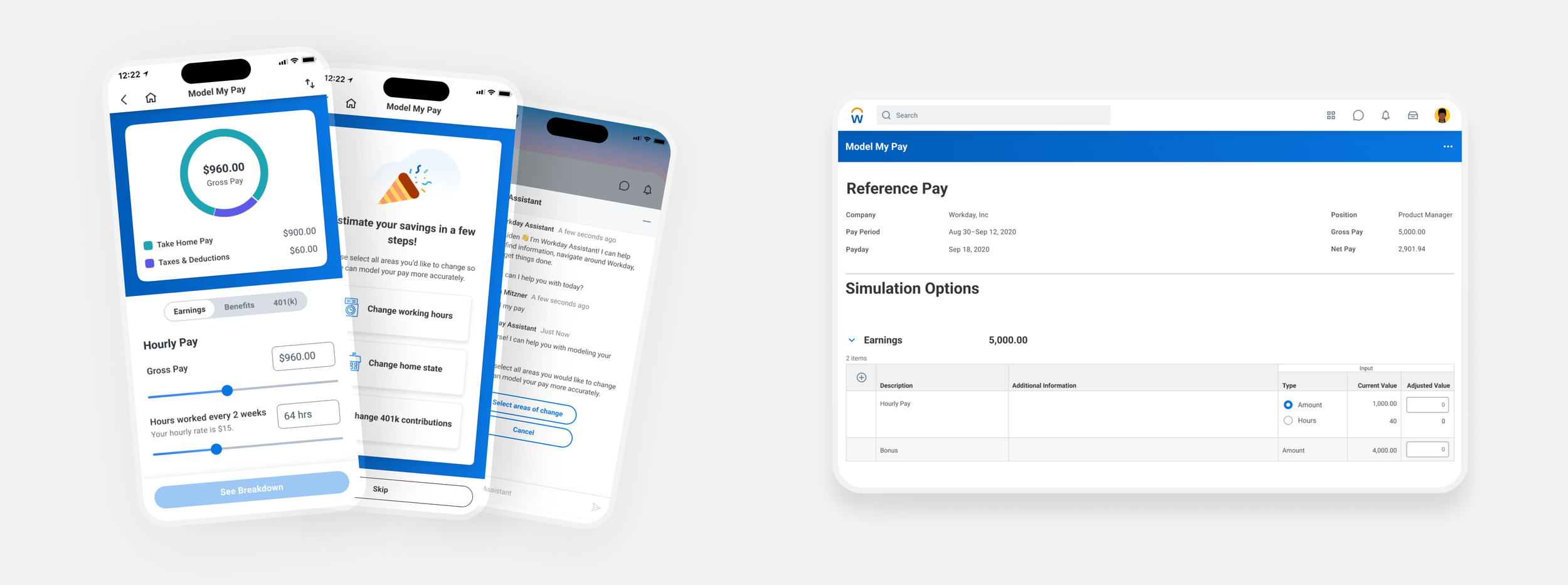
In the short term, we focused on small but meaningful desktop updates, improving onboarding and clarifying expectations as users modeled their pay. In the long term, we aimed to build a more interactive solution, inspired by the Calculator mobile prototype, that lets users manipulate their pay inputs and see real-time changes.
Results
active engagement
2.3 mil
payslip scenarios modeled
Customer Adoption
832
Unique customers
Recognition
team
Eric anderson
ron amrhein
JT Gryder